I have discovered two drawbacks (pardon the pun) to having my art supplies neatly organized in mugs on my drafting table.
1. They are much more appealing than my daughter's disorganized materials.
2. They are easily removed from my drafting table...
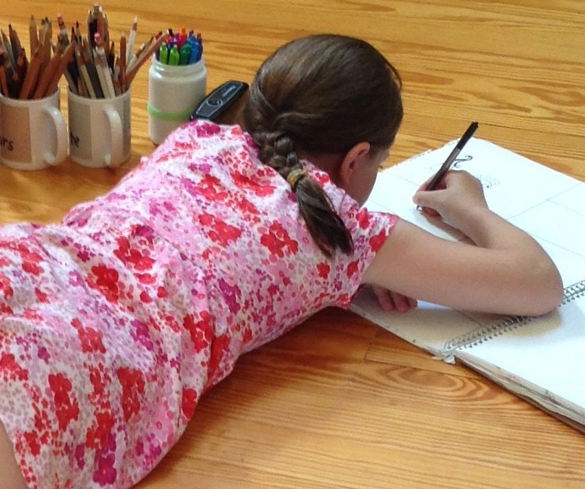
Although I have to admit that I also work on the floor... the bed... the couch. Which is why my supplies are so portable.
So what have I been doing on my actual drafting table?
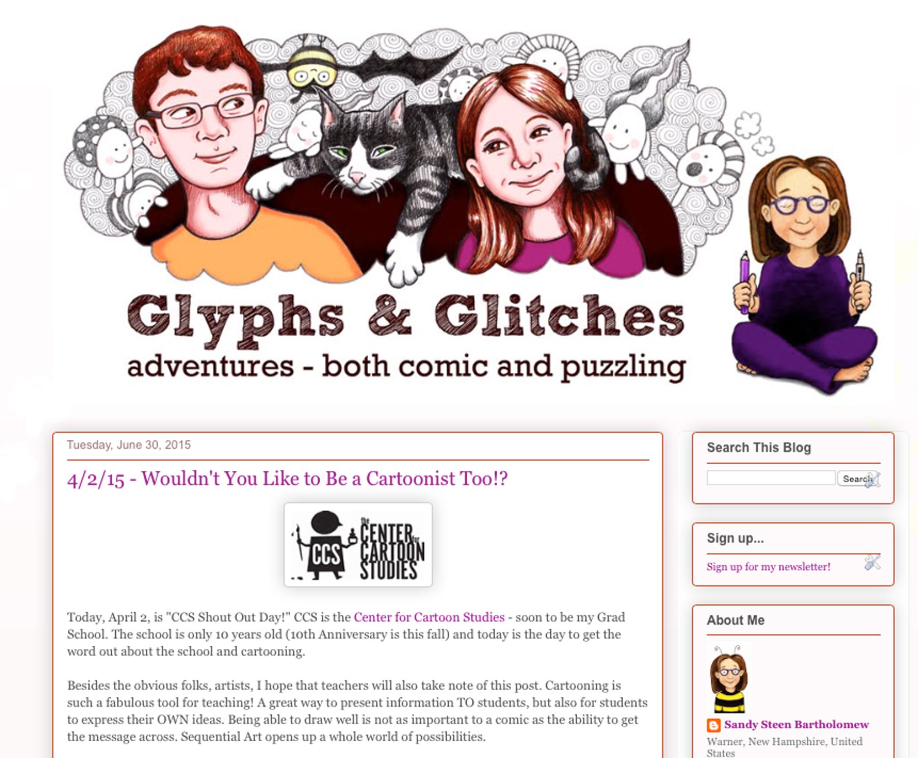
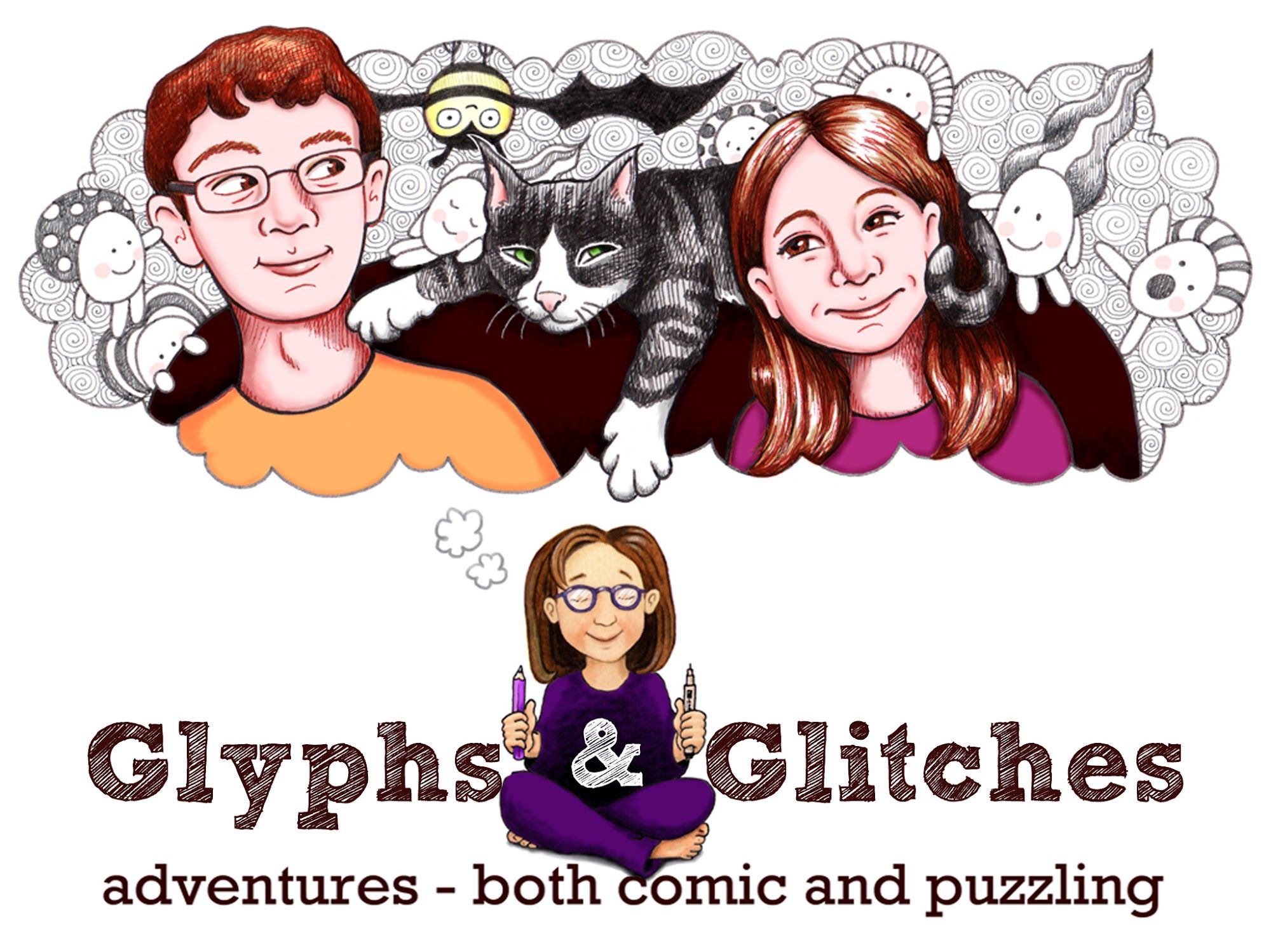
I thought I would show you how I created the header for my Glyphs & Glitches blog. This is also the same design I used for the project image on Kickstarter, with a slight shift to my cartoon character.
If you have been curious about the Kickstarter Project and wondering what the blog will be like, this post will give you a good example.
The Process:
This was the original blog header:
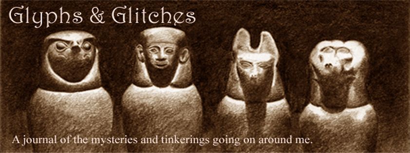
It's a pencil drawing I had done of canopic jars - to go along with the Egyptian "glyph" part. And if you have canopic jars in your life, you definitely have a "glitch" or two. (Canopic jars were used to store the organs when a person was mummified).
I updated it to be more relevant to cartooning and added my avatar "thinking"...
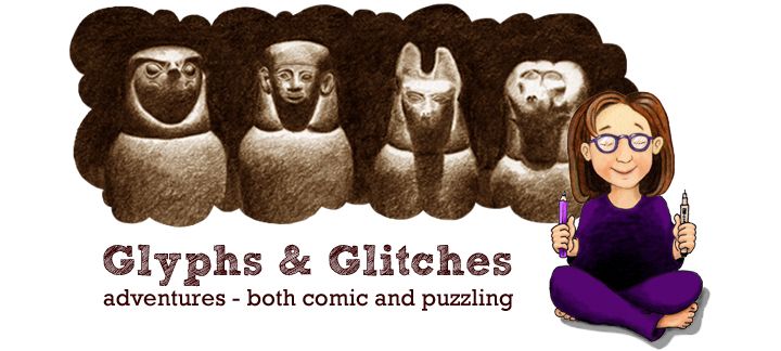
But my art directors didn't think anyone would "get" it. My sister (art director #2) suggested I start over and have me thinking about my kids and cat, since that is what I write about... with cartoon accents. Fine.
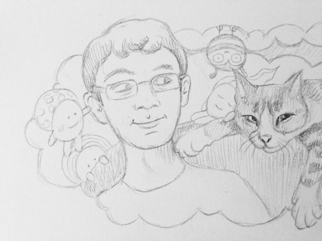
I started with a pencil sketch of the kids sitting on the sofa with Minou sprawled on the back.
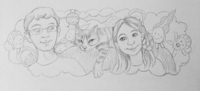
The Lilah Beans found their way in and, as usual, started interacting with the other characters. One is pulling Alex's ear, one is sleeping on the cat's paw, another is petting Lilah... and I tossed a Bumblebat in too, just hanging around.
I inked over the pencil sketch with brown ink for the kids and dark gray for everything else.
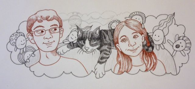
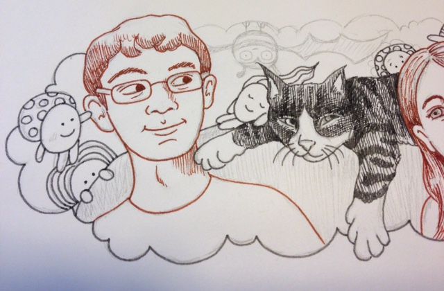
I added the tangle, Printemps, in the background in light gray ink because I tend to put it anywhere I need to fill space. Swirls appeal to my chaotic mind...
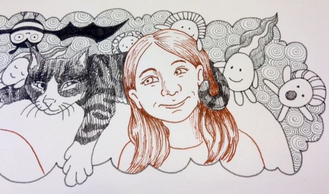
I added more brown to the kids with crosshatching, then darkened the shadowy areas with black pen.
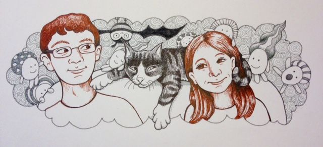
I really liked this 3 color drawing. This is where I also get stuck. Keep it simple? Or push it with color? Agh. Once again, the art directors decided "color!" And I thought - yes, that could work... just as I liked the contrast between the slightly realistic drawing and the cartoon drawing, I thought I could use the monotone cartoon against the colored reality.
I didn't really think that hard about it, I was getting desperate to get to work on the rest of the Kickstarter project!
So I scanned the art into Photoshop (actually I use Photoshop Elements, but I intend to learn all about the "real" program in school).
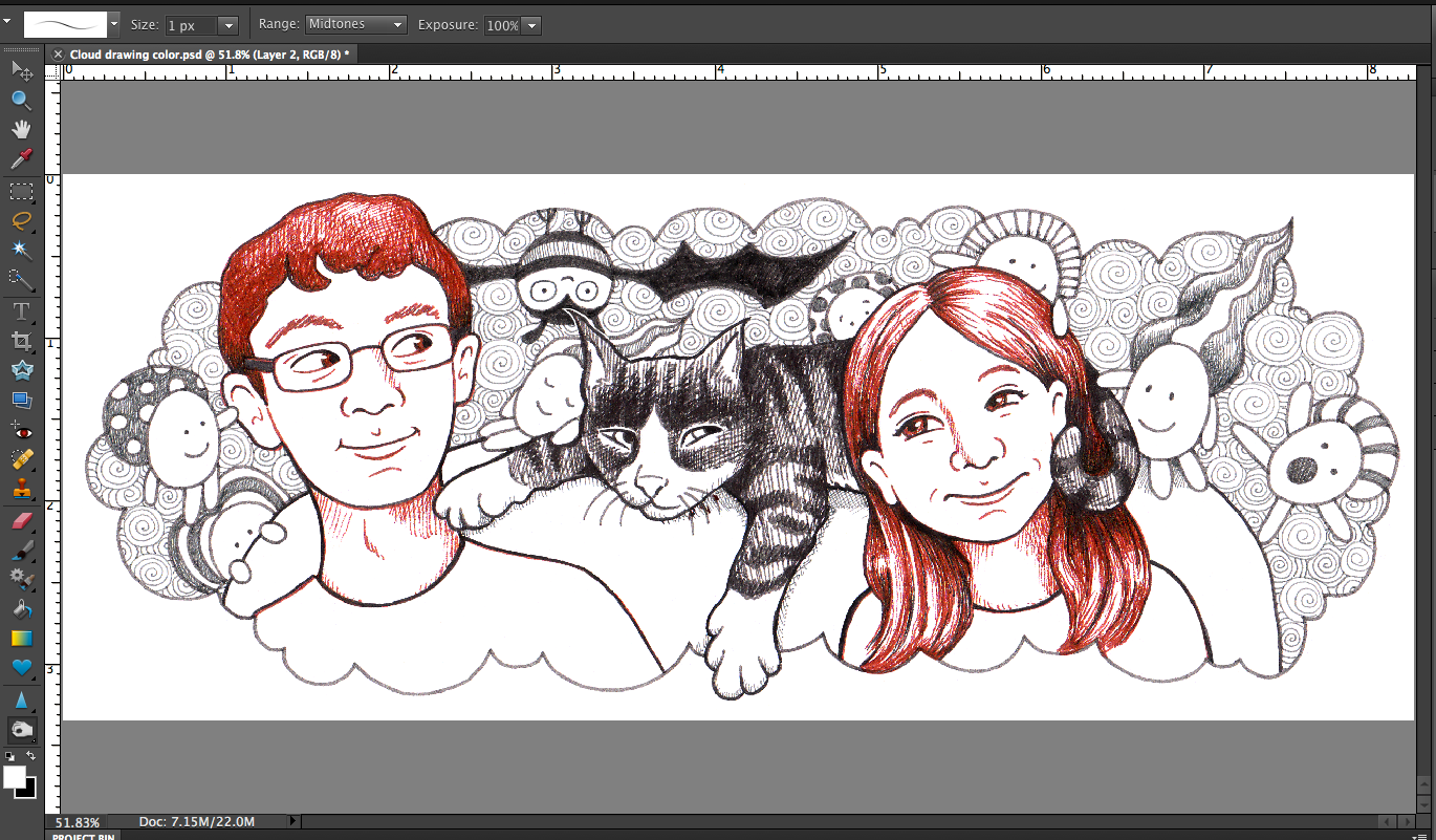
I created a new layer to do all the color work. When I hid the line layer, it looked a little creepy! Notice the Lilah Bean's pink cheeks just floating in space?
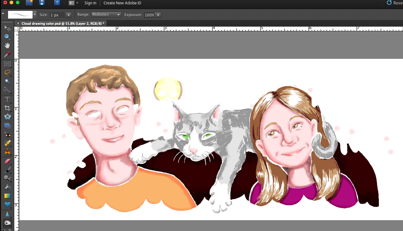
But all together, I thought it worked...
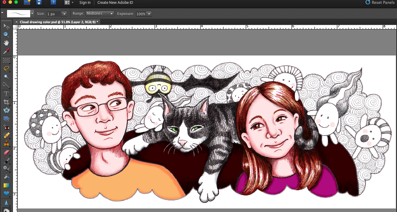
I added my cartoon character thinking about it all, and the type, and then resized it to fit the width of the blog header. This is an actual screen shot from the blog:
The project image on Kickstarter has to be in a square format, so I rearranged the bubble, me, and the text:
Subscribe to our email newsletter and unlock access to members-only content and exclusive updates.
Comments