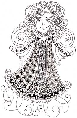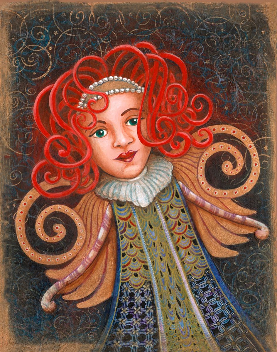
I designed this angel for our town's "3rd Annual Warner Holiday Shopping Tour." In the ads and on the posters she is holding red shopping bags. I was inspired by the Klimt paintings that I have been researching lately. Klimt's images have realistic painted faces and then the clothes are more geometric, abstract, and full of patterns. And he uses lots of gold.

I think of my painted version as more of a holiday fairy or muse than an actual angel. I was kind of bummed that the one for the ads and poster isn't getting much face time. She's being shrunk down to nothingness in favor of more text. Maybe it's because I am 90% illustrator and only 10% graphic designer... but I think posters and ads should be all about the image. So I have decided to use my painted version for my own holiday ads and cards. I made a giclee print of her too, which I have for sale in my gallery at Wingdoodle and I will put on Etsy soon.
What I think is interesting about her, either version, is that everything, except her face, is created from tangles! Gives new meaning to "tangled hair," eh?
Subscribe to our email newsletter and unlock access to members-only content and exclusive updates.
Comments