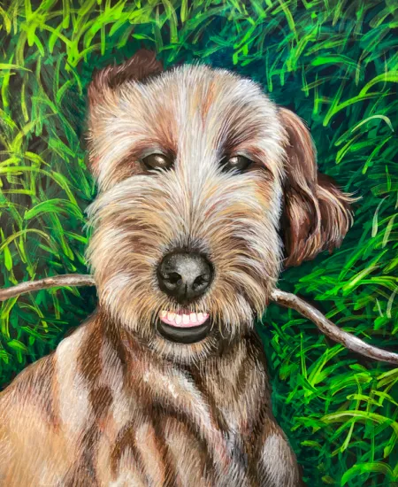
I keep giving myself challenges to paint! Mostly, I've been using liquid acrylics on a thick mixed media (watercolor) paper with spiral sketchbook holes along the edge. This is to focus on practice rather than thinking of the painting as something I can sell. The paper gets a little wonky but it scans well and I can make nice prints.
After the challenge of matting those prints and taking them to the gallery for the show, I felt intimidated by all the "real" art on the walls. Real, as in, actual, original paintings, etc. So for this week's challenge, I decided to create a painting, a portrait, on a surface meant to be displayed on the wall. I don't like canvas, so I have a stack of painting boards of different thicknesses. I used to create 3-D painted collages using polymer clay mosaic tiles and stuff like that.
I used black gesso on the top, and the sides of the panel, with chalk to sketch in the main shapes. Painting the grass blades was a lot of fun. &It's hard to get good photos since the paint is shiny and reflects the lights.)
I blocked in the big areas of Theo's fur, starting with the darker areas. His eyes and mouth look really creepy!
Adding in some fur details... OK, painting dog portraits is HARD!!!Their noses are so ... weird. (Cats are soooo much easier to draw!)
At this point, I have reached the part of every painting where I start to question my sanity, and my talent.
KEEEEEEP GOOOOOING!!!! (But maybe take a break, eat dinner, watch Netflix....)

Yeah! Finished! (or "good enough!")
Then, the hard part.... getting it into the computer.
I suddenly remembered WHY I usually work at the size I do, on the paper I use... a 12"x12", 1-inch thick wood board - does not fit on my flatbed scanner!!!????? And since it isn't flexible, I can't scan it in segments. Any section (which is all of them in this case) that doesn't lie flat on the scanner - is blurry. I also had a lot of trouble trying to take photos since the shiny paint reflected the lights. All that to say - this painting looks a lot better in real life - more 3-dimensional and furry. And the subtler colors are more visible. Maybe that's the real difference between fine art and illustration? Fine art looks good in a frame, illustration scans well. ;-)
And no, I don't want to start a business doing pet portraits. Unless you offer me a ridiculously large amount of money, then, maybe...
This painting makes me smile, I'm actually glad it's not going to be stuck in a sketchbook!
Subscribe to our email newsletter and unlock access to members-only content and exclusive updates.

Comments